Edit Header
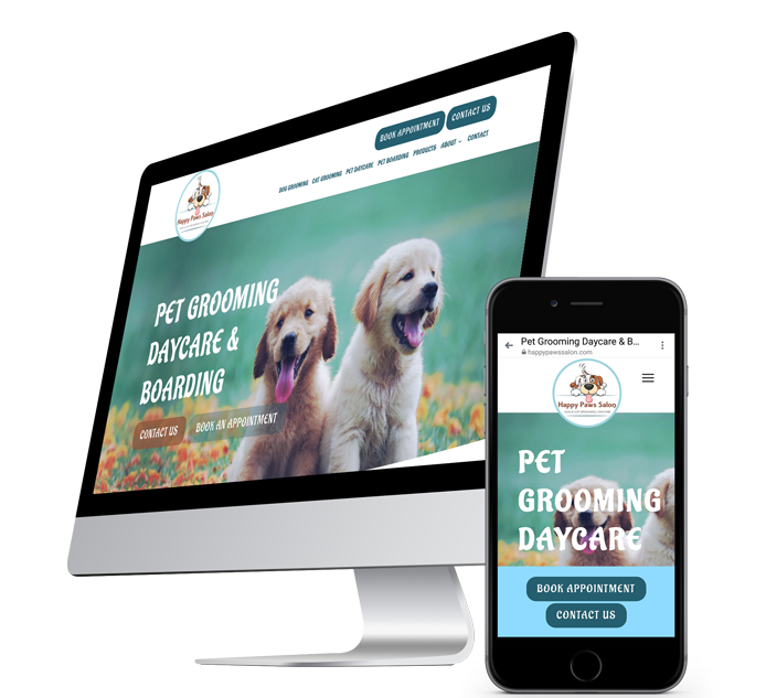
How to edit your header
The header for your website is the first thing your website visitors see and should contain a logo, your navigation menu and a call to action button. Your website template comes with a predesigned header that you can customize by adding your logo, updating the button and changing the navigation layout. If you're feeling like a design wiz, you can also customize your header further using features in the website editor.
Watch the brief video above to understand header design and keep reading below about header customization.
Upload your logo
Upload your logo by clicking on the place holder logo image in your template, then upload your logo file. It is possible to resize and edit pictures in the website editor if needed.
Add a button / customize button
Buttons are the easiest way to get site visitors to take action. Buttons can lead visitors to another page on your site or to a page on a different website. Buttons can also open a popup, contact form, online reservation, email address, and more.
To edit your button to reflect what you'd like to lead your customers to in your header:
- right click on the place holder button in your header
- then Edit Design
- Change fonts, colors, and the button shape / radius as you wish
Learn more about the button widget here.
Format header menu
The header is essentially a menu for your site visitors that contains your logo and website navigation. There are a lot of different ways to control the style of your header to help you create an appealing header for your site. Your template comes with a header design that you can change if you desire.
To edit: Right click on the menu, then Edit Design.
Please note: the header that shows on mobile devices has a fixed design, and cannot be customized.
But you are able to change the content of the mobile header:
- On the top navigation bar, click Mobile view & edit.
- Click the content in the header to edit.
Header types
Flexible headers
In order to customize a header, it must be turned into a flexible header by turning the header into a row. In most templates, the header is a row by default. However, in certain older templates, the header is fixed with limited customization options. Templates with fixed headers typically include certain widgets, such as social media links or a phone number in the header by default. However, these widgets are fixed and cannot be moved like widgets in normal rows. By turning the header into a row, you can add or edit widgets in the header.
Note
If you have turned your header into a flexible header and later decide that you want your header to be fixed, you will not be able to change the header back.
To set a header to be flexible and convert the header into a row:
- Hover over the header, and click Header.
- On the Content tab, click the Convert header to a row toggle.
In most new templates, the header is a row by default, so you are only likely to run into this issue when using older templates that still have fixed headers.
Fixed headers
In some of our older templates, headers are fixed. This means that the header contains the logo, navigation, social icons and text, but is locked and cannot be customized by adding widgets from the Widgets section.
Sticky headers
To make a header sticky, hover over the header, click Header, and select Set As Sticky Header. The header becomes static and stays in place when you scroll through pages in your site.
To learn more on Sticky Headers, watch this brief video.
Header layouts
To change the header layout:
- Hover over the header and click Header.
- On the Design tab, select a new header layout. Switching to one of these layouts changes fixed headers into flexible headers. Using pre-designed headers helps save time in designing your site. You can always select a layout and then modify it afterward.
Note
Selecting one of these layouts removes any existing content from the header section, so ensure you have a backup before selecting these options. When using one of these layouts the header becomes flexible and are not able to switch back to a fixed header.
Shrinking header
The Shrinking Header is a smaller version of the site header, enabling you to keep important navigation information fixed without distracting users as they scroll down a page and without taking up too much space. It acts as a sticky header feature but condenses the size of the logos and other widgets in your header.
It is particularly useful in sites that have large headers and sites that are designed for long scrolling.
The shrinking header is available on Desktop and Tablet views. Shrinking headers can only be toggled when the header is turned into a row. If the header is not a row and the template has a fixed header, the shrinking header option is not available.
For more information, see Headers.
For more information on how to configure shrinking headers, see Shrinking Headers.
Hide headers
To hide a header on a page:
- Hover over the bottom of the header, and click Header.
- Click Hide page header on, and select the device you want the header hidden on.
To unhide the header:
- In the side panel, click the Unhide Elements () icon under Settings.
- Click the Hide icon on the footer, and select Yes to unhide the header.
Header logo
If the header contains one image, the logo of the site will be kept when moving between header layouts. In the case there is more than one image, or the logo is textual, the logo image is kept as in the layout.
If you delete the logo, re-add the image by dragging the image element back into the header, and set the link to go back to the homepage.
Other header options
There are other header options available in the design menu, which let you further customize the look of your header.
To access the header design menu, hover over the header, click Header, and then click the Design tab.
To display header items above hero images, click Overlap first row. This gives your hero images more visibility and makes it easier to design great-looking, trendy sites. Keep the following in mind:
- For the header. Set the background color to transparent, or a color with opacity.
- For the first row. Use top padding that is equal to or similar to the height of the header.
When switching to a new header layout that contains social icons, the icons are displayed as defined in the content library. If there are no social links, the social icons are kept generic as in the layout.
As you can see, headers are important, but not too scary! If you would like more information on the details of setting up your header, please see this article from Duda.